Taking Pictures of Landscapes – Cityscapes 1

Cityscapes of streets and scenery glowing with the setting sun are always beautiful and dramatic.


Foto kurzy

Taking Pictures of Landscapes – Cityscapes 1

Using the SCENE mode
Cityscapes of streets and scenery glowing with the setting sun are always beautiful and dramatic. The sunset light changes all the time, leaving only a short period when the light is perfect for taking the picture. If you take too long changing the settings on the camera, you may miss the right moment for a sunset scene. The [SCENE] modes will come very handy in such cases.

Use the [SCENE] mode’s [SUNSET] mode for twilight pictures of the city
The [SCENE] modes allow you to change several settings automatically to match the subject. Try using the [SUNSET] mode to take pictures not only of the sunset itself but also of city scenes illuminated by the sunset glow. The result will be beautiful pictures, slightly tinged with red tones that reproduce the look of the twilight scene.

Many times when you take pictures of twilight scenes, the sunset in the picture does not come out red enough and looks disappointing. The [SCENE] mode’s [SUNSET] mode emphasizes the red hues in the picture. So you will be able to get impressive pictures of sunsets. And you can still use the exposure compensation function even though it is a [SCENE] mode. By adjusting the exposure compensation towards [-] you can get richer sunset colors. You could take several pictures with different adjustment values to try different brightness levels.

The [SUNSET] mode emphasizes the red hues of sunset scenes

     
Picture taken using Program Auto
(P) mode
Picture taken using SCENE
(Sunset) mode)


Combine with exposure compensation to bring out the atmosphere in the picture


Useful things to remember

  • Some camera models have the [ (White Balance Compensation)] function. By using it and adjusting towards RED you can accentuate even more the red tones in the picture.
  • The actual effect will depend on the subject but by setting the white balance to [Cloudy Day ] you can emphasize the red tones even more than in real life.

Samsung NX10

The introduction of the so-called professional compact cameras or the ‘non-SLRs’ if you want with the Micro Four Thirds standard (we’ve already introduced Olympus Pen E-P1a Panasonic Lumix DMC-GF1 on the WoL site) opened a new field of camera development in digital photography. In the scope of image quality, these cameras reach the standard of SLRs, as well as being lighter and much more compact. No wonder that another company entered the market with a similar concept shortly after the others – this time it was Samsung.

The Korean giant producing everything from ‘safety pins to a train engine’ decided not to go along the original Micro 4/3 standard path, but chose to create its own concept. The principle is the same however; a high-quality electronic viewfinder has replaced the usual mirror, the pentagonal prism and other mechanism and optics. Also, the length between the bayonet and the lens has been shortened, but…. This is where the fundamental distinction occurs – Samsung has used its 14Mpx CMOS sensor of the APS-C (23.4 x 15.6 mm) size – a chip approx. 1.5 times larger than the ones in sensors of the Micro 4/3 standard. In order to be precise, image cells of the Samsung NX10 are approx. 1.2 to 1.3 times larger than the Micro 4/3 cells with regard to higher resolution.
The alternatively sized sensor also calls for a specific type of optical accessories, capable of capturing a greater image circle. Samsung NX10 is therefore incompatible with other cameras, as well as the lenses of the Micro 4/3 standard due to its optics. It’s a matter of two different worlds, even though the concepts are basically the same.

Photo Samsung

While creating the drafts and proposals for the design of the first model of the NX series, the Samsung developers stayed somewhat conservative – they selected to go with shapes not so different from an SLR. Only from the side is the smaller depth of the camera obvious and visible. Besides the usual all-black plastic body model, the market should offer the camera in a silver metal coating with black supplements.
In spite of its smaller dimensions, Samsung NX10 embodies a very good ergonomy of holding and controlling, thanks to the already mentioned ‘SLR-based design’ with a relatively outstanding grip for the right hand.

The allocation of numerous controls is subject to the classic structure of a camera – incidentally, that is the indicator for advanced cameras. Most of the control buttons are situated on the right side next to the sizable display. However, do take notice of the space made available for the thumb of the right hand holding the camera.
Unavailable with any other camera in the corresponding class, Samsung NX10 offers a special feature in the form an AMOLED type display (Active Matrix Organic Light Emitting Diode). It is not the typical LCD display, but quite the opposite in its principle. This review is not bound to enter the depths of the technology behind such displays, so in very basic and simplified terms: Contrary to the LCD display, where they require a backlight, image pixels of the AMOLED display are actively and individually lighted. It is therefore only logical that when one of the diodes is turned off, we can create a perfect black color – something an LCD cannot do. As a direct consequence, we reach a much higher image contrast, also leading to a more precise and correct color rendering. The AMOLED display also offers its users another advantage in form of an unlimited angle of view. While the accuracy of the color rendering is hard to prove, we can confirm the unusually high angle of view coverage based on several tests.
It is also necessary not to overlook the sophisticated electronic viewfinder with a VGA resolution. The images on the screen are very soft – manual focusing is not an obstacle whatsoever and it even includes a magnifier. EVF display is activated automatically once you close in on the camera with your eye – a result of the discrete infrared detector under the eyepiece.

Samsung NX10 – in short
Resolution 14 Mpx
Sensor APS-C (23,4 × 15,6 mm)
Optics exchangeable, lenses of the Samsung NX standard,
lens stabilization
Video HD (1 280 × 720 px)

Samsung NX10 belongs in the fully equipped ‘non-SLRs’ category in the sense that it has not only an inbuilt electronic viewfinder, but it also includes a pop-up flash. Its power is low for obvious reasons (guide number 11), however, the hot shoe in the center allows for a more powerful external flash. At the moment, Samsung offers two types: a solid compact model with GN 20 and a larger model with a pop-up and swivel head with GN 42.

Along with the high amount of buttons, Samsung NX10 includes a control dial for the different values of exposure, just like most of the SLRs as well as cameras of the Micro 4/3 standard. In rather untraditional manner, the control dial is placed vertically at the top of the camera, right behind the shutter button.
NX10 is equipped with all of the advanced high-tech functions – there is no need in listing them all. The autofocus is very reliable and the camera also works well in the ‘continuous focusing’ regime. This camera doesn’t use sensor stabilization, such as the ones of the Olympus PEN series, but the individual lenses are stabilized, including the basic zoom Samsung 18-55 mm F3.5 – 5.6 OIS.

Photo Samsung
Super features
High sensor resolution
High image quality
Perfect ergonomy
User-friendly controls
High quality viewfinder and display

If we could point out something Samsung NX10 lacks in comparison with cameras of the Micro 4/3 standard, it would definitely be the availability of optics. At the moment, the market offers three types of lenses: the already mentioned stabilized basic zoom 18-55 mm F3.5-5.6 OIS (OIS = lens stabilization), tele zoom 50-200 mm F4-5.6 OIS and lastly, the excellent lucid ‘pancake’ lens with stable focus 30 mm F2. Nevertheless, Samsung has announced it will make more lenses available on the market this year. We’ll see how long it’ll take for a macro lens or an 11x ultra zoom to appear on the market.

Screenshots of the menu of Samsung NX10

Overall evaluation

The adversaries of 4/3 or the Micro Four Thirds standard must be waiting eagerly for the evaluation of image quality a larger APS-C sensor brings. Yes, it is excellent. In some ways, it is even better. For example, regarding the rate of noise the NX10 wins over the Pens or the ‘G’s – Samsung simply corrects it better. However, it needs to be stated in all seriousness that image quality is not distinctively better and we can even find some characteristics where Samsung lags behind. For example, automatic white noise compensation in nonstandard conditions is nowhere near perfect – see pictures from the auto showroom.
Overall, Samsung NX10 is a great camera, perhaps even outstanding. The NX10 would surely amaze the members of the Week of Life project with its small attractive proportions and along with the lucid 30mm lens for instance, it is predestined for everyday carrying and documenting stories that life brings. At the same time, ergonomy is excellent, user friendly controls is always an advantage and so is the comprehensive selection of functions; and ‘only as the most important factor’, it offers perfect image quality.

Common Price (at the time of this review being published): $699.00 (Body and basic zoom lens set)

Basic Technical Data for Samsung NX10

Sensor

CMOS 23.4 × 15.6 mm (crop factor 1.5 ×)
14 Mpx (4 592 × 3 056 px)
Light sensitivity ISO 100 to 3 200

Shutter

30–1/4 000 s
Flash X-sync 1/180 s
Burst buffer 3 fps

Optics

Exchangeable lenses of the Samsung NX standard

Autofocus

15-point

Memory medium

SD/SDHC

Data formats

Image: JPEG, RAW (SRW)
Video: MOV

Video

1 280 × 720 px, 30 fps
640 × 480 px, 30 fps
320 × 240 px, 30 fps
Mono sound

Display

AMOLED type
Screen size 3“(76 mm)
614 000 px

Viewfinder

Electronic viewfinder
921 000 px

Power supply

Li-Ion battery

Dimensions and weight (body only)

123 × 90 × 60 mm (w × h × d)
410 g (incl. battery and memory card)

Functionality: Notifications on new contributions

We would like to introduce you to a new functionality of our pages.
You have certainly noticed that there is a new function „Alert when new contribution to the discussion“.

Thanks to this button, you will never forget a discussion that you are interested in and you will get a notice either in your Week of Life inbox or to your mailbox.

Week of Life notifications

If you want to change notifications settings where and how they should be delivered, go to My Account and choose User email tab (picture)

Week of Life notifications

In every row you can find one type of notification. Each type of notification can be set to your internal Week of Life inbox or to your regular email.

Week of Life notifications

If you turn off  „Alert when new contribution to the discussion“, all notifications concerning new contribution to a discussion that you have followed so far will be turned off. List of all discussions that you follow is at the bottom of the page (picture). By clicking on the icon of the trash bin next to a discussion, you will turn off notifications only to that specific discussion.

Week of Life notifications

We hope that this new functionality will make the Week fo Life webpage more comfortable for you and that it will make your time spend on Week of Life more pleasant.

Have a nice day, Week of Life team

Funkcionalita: Upozornění na nové příspěvky

Rádi bychom tě touto formou seznámili s novou funkcionalitou stránek www.weekoflife.com.

Jistě jsi zaznamenal/a, že u každé diskuze na našich stránkách přibyla nová funkce „Upozornit na nový příspěvek v diskuzi“. Díky tomuto tlačítku již nezapomeneš na žádnou diskuzi na stránce a každý nový komentář ti přijde jako upozornění buď do schránky na Week of Life nebo do tvého emailu.

Notifikace Week of Life

Pokud by sis chtěl/a nastavit jaké notifikace ti mají chodit a kam, klikni na Můj účet a tam vyber záložku Uživatelský email (viz obrázek).

Week of Life notifikace

V každém řádku je napsaný jeden druh notifikace. U každého druhu notifikace se dá nastavit, zda ti má chodit do tvé interní schránky na Week of Life nebo do tvé emailové schránky.

Notifikace Week of Life

Pokud si vypneš „Upozornit na nový příspěvek k diskuzi“, automaticky se ti vypne upozornění na nové přispěvky u všech tebou do teď sledovaných diskuzí. Seznam všech tebou sledovaných diskuzí najdeš v dolní části této stránky (viz obrázek). Pokud chceš vypnout sledování jen jedné diskuze, klikni na ikonu odpadkového koše.

Notifikace Week of Life

Doufáme, že ti nová funkcionalita usnadní orientaci a zpříjemní tvé chvíle na stránkách Week of Life.

Hezký den ti přeje tým Week of Life

Searching for light amidst the darkness with kevin v. ton

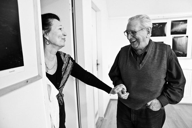
kevin v. ton, Graphic designer, Czech Republic

Week of Life Masters is probably the most viewed and observed section at our portal – be it its fascinating photographic content or the ability to understand and fulfill all of the recommended rules and conditions of our project. This is the reason for the section not appearing on a regular basis, since we usually have to wait for someone eligible to appear. Someone who is worthy, based on the photos as well as their personality expressed, and brings forth such interesting material, worthwhile to observe, explore and obtain a few confessions from the author. Such description fits our newest acquisition, a graphic designer with a slightly mysterious name, perhaps a pseudonym, kevin v. ton. The decision process was long but we have reached a decision eventually and after reviewing his answers, we were able to confirm that our choice was spot on, not only thanks to the photos he has shared with us.

How did you get acquainted with the Week of Life project and what made you join its cause?

I found out more information about the project in the middle of October last year from my old friend from southern Bohemia. I came across some basic ideas of the project even before that, but nothing concrete or precise that would catch my attention. Only when my friend showed his upcoming week to me on the monitor, as well as weeks of other photographers portrayed on WoL , finding out that it was a project of Mr. Zika, have I decided to try it out myself. And indeed I started in the scope of the next 14 days. No one knew, not even my family, about me being involved in the project only until a few months later, when all the images were already scanned and the whole week was ready to be published.

The whole idea to merge results of the weekly artistic documentary visions of photographers scattered across the whole world ‘under one roof’ is not only unique, but also useful and necessary in my eyes. The possibility to see individuals from all corners of our planet living their lives in the scope of days and weeks makes us aware of their existence; people with their happiness and everyday issues no matter the color of their skin, the regime into which they were born or the economic prowess of the country they come from.

You work as a graphic designer. Can you be more precise regarding the field of graphic design?

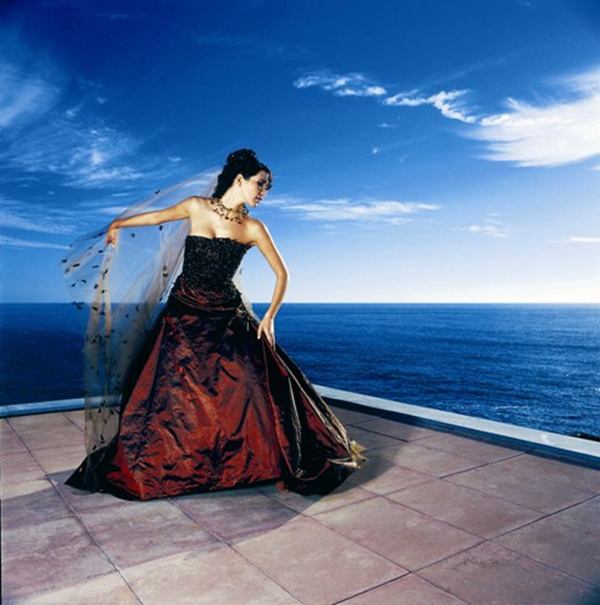
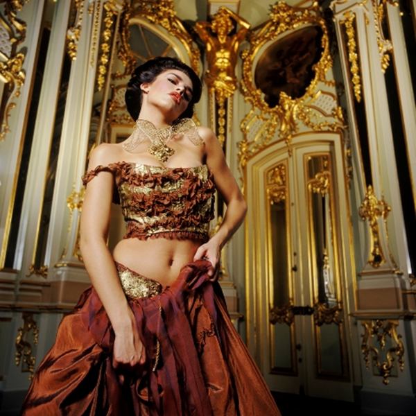
Even though I consider myself as a photographer, I make a living mainly as an artist, draftsman, typographer and a PC graphic designer. Every job involving creative freedom is a challenge, be it a CD cover for a starting underground band or a corporate identity of a flourishing corporation.

As one of the few, you shot your first black and white week on a celluloid film. What led you to make this choice; was there any specific thought behind it?

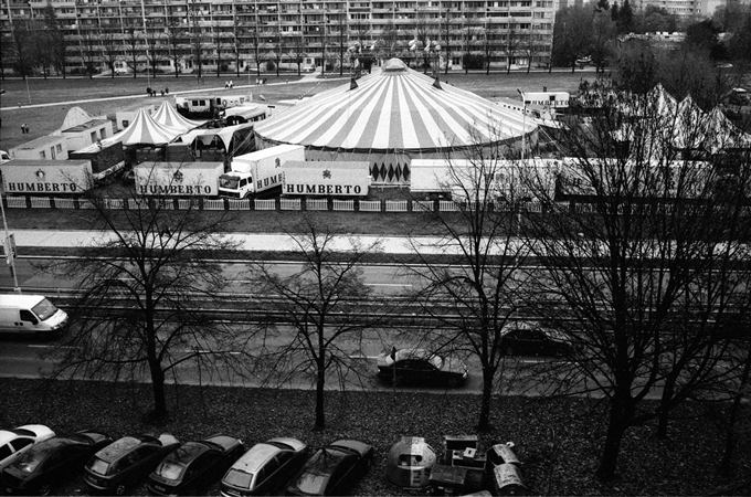
I’ve been working with black and white celluloid film for almost a quarter of a century now and I still enjoy it very much. After so many years, I’ve managed to learn to carry around one or two of the elderly F3s from Nikon and an M-series Leica; each body with a different glass and a separate celluloid film. Most of the times, I use the Ilford Delta 400 and 3200 or the Neopan 1600.

I still have the feeling that it has unique characteristic features including the resulting visual image, hard to be superseded by digital technology.

Documentary photos and celluloid film shooting are like the groom with a bride – together, they can form a perfect couple, a family able to bring beautiful offspring to the world in the form of astonishing photos. Despite all that, I do use a digital camera and truly search for the charm it undoubtedly has. And thanks to the work connected with the WoL project, I’ve found it – the speed at which it processes and converts the documented data.

It’s quite pleasant to read and find out that there is still someone out there today to trust celluloid films and classic photography. Tell us what you think about the situation in the future and how will it evolve; will the analog world cease to exist or will it survive forever alongside the digital world.

A rather confounded question I must say, as if it concerned foretelling the future. Personally I am convinced that there are many more years to come when analog will go hand in hand with digital. And I certainly hope so. It’s a similar situation to what the good old LPs experienced in the beginning of the 80s when CDs emerged with the digitalization of music. Despite its massive withdrawal from the market, record-players and LPs are still being made and sold thirty years later. Luckily, there are still enough people that like their classic sounds of the records in spite of their ‘nuisance’ such as squeaking, cluttering or the necessity for manual turning of the record to listen to the other side. CDs no longer experience this, but don’t have that extra aspect a person needs as a human being; the element of randomness, the disturbance of stereotypes. The same applies to cine film or the celluloid material as a whole. What tends to be regarded as imperfection, I perceive as an advantage. Having only 36 images available, a person learns to apprehend each situation physically and emotionally, concentrate on the essence of what is at stake and be able to see the resulting image in his or her head before the whole exposure.

To stay simple and practical, another reason to ‘think before you act’ is simply that it takes a while to change the celluloid. For its characteristics, I usually choose the one applicable and corresponding to the given scenery. Frankly, scratches are the cherry on top. Plus, they can always be edited afterwards.

In contrast with the analog, digital allows for massive increase in quantity, but never with the guarantee of higher quality. In reality, it doesn’t really matter which camera you use, analog or digital. Content is the important factor, along with the message, the silent moment. The audience rarely looks at how the image was created; it’s just a technical matter. They either accept the image or they don’t.

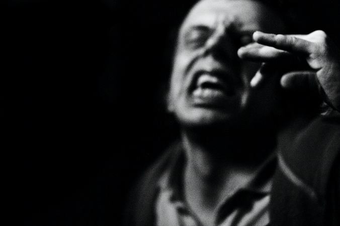
When looking at your photos, it is rather obvious you are not afraid to work with dark situations, the atmosphere at night. Do you feel affiliated with black color or the other dark vibrant colors?

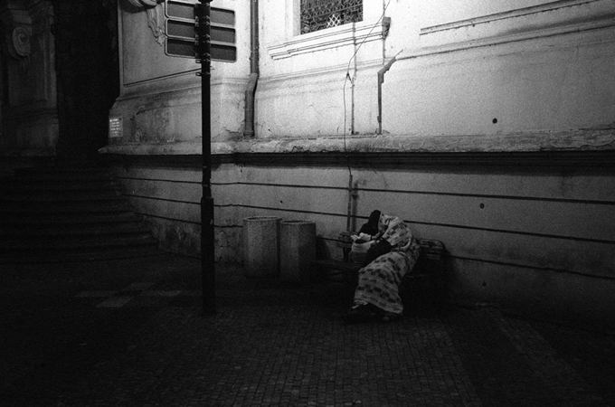
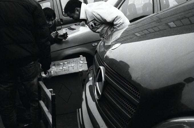
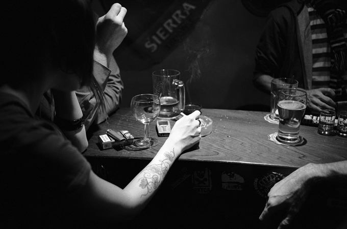
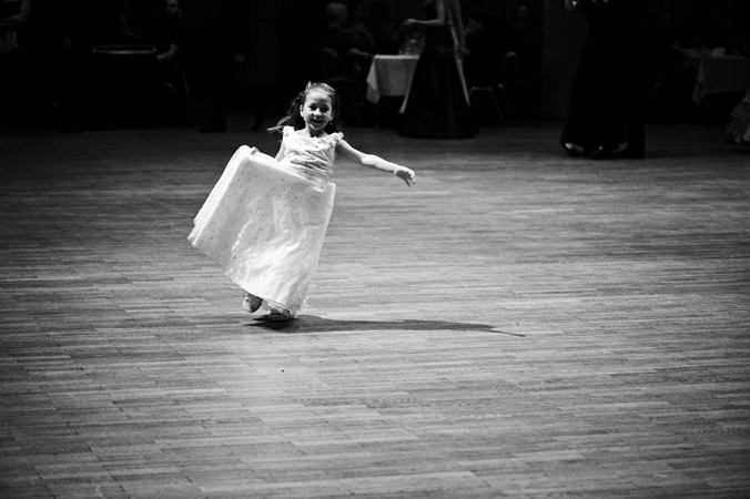
I don’t think there is any kind of special and stable affiliation with a specific color, not even black or any other dark color, or white for that matter, since we are mainly talking about my black and white sets. These two colors are counterparts, opposites, unable to live without each other; Jing and Jang. However, I do admit I savor the moment while searching for people in the shadows of the night, looking for the truth exposed by the light from the street lamps, the abandoned store windows, the blinking neon lights or the lights of the passing cars; the search for a human being in murky pubs full of smoke or in corners of a quiet town.

This kind of search for light I do like indeed – roughness of the world, authenticity, moments when the hyped up human desires and needs stand out from the dimness of the night.

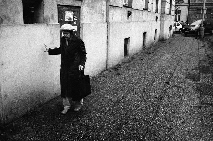
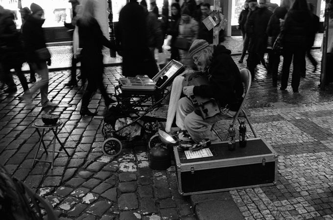
The ‘grandmother leaning against the wall’ was chosen as a cover photo for the Editor’s Choice. The homeless under the lamp also cannot go unnoticed along with other similarly themed photos. You seem to have a social sentiment; do you enjoy taking pictures ‘below the main deck’?

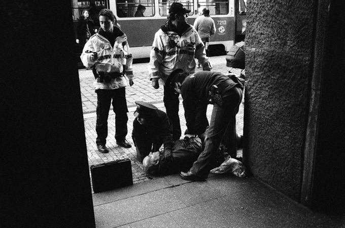
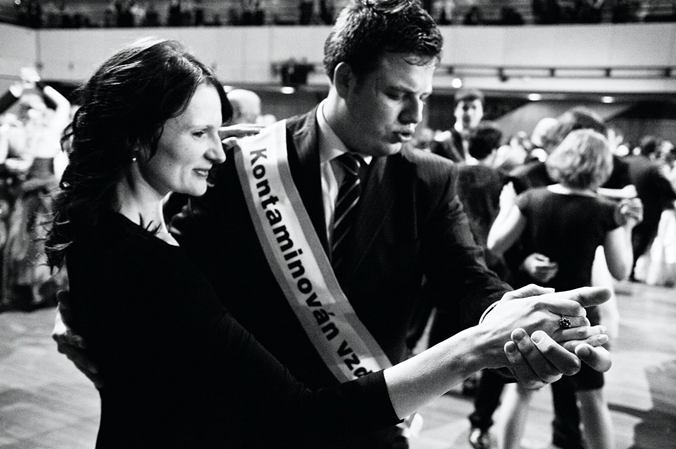
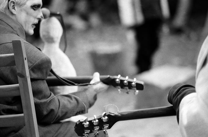
I’m interested in human beings above all; their fate, their place under the sun, the fulfillment of a person’s dream as well as the consequences of his/her failure. I tend to look for the essence behind things, the essence of humanity. I seek a person, whoever he may be, wherever he lives, whichever profession he occupies. I seek the person within a person.

Your photos are emotional and frequently evoke reactions, being the main idea behind documentary projects. Would you consider Week of Life to have the possibility, the potential or at least a small chance to inspire emotions, feelings, thoughts in people in the future and maybe make the world a slightly better place?

Week of Life is a very fascinating project and has an enormous amount of potential in the documentary sense. As it goes with documentary projects, it’s a long distance run. And with Week of Life, the distance is infinite, unable to count how many times it makes the way around the whole planet. The possibility to view the world through the eyes of a colleague photographer, perhaps living exactly on the other side of our planet Earth, is simply amazing. If the high standard set will be kept above a certain level on a long-term basis, perhaps even kept higher than intended, and will not demean itself to more or less a shared family album with characteristic legends as it is with other social portals, it will become a magnificent photographic archive, a document so large in extent and uniqueness with no equal. Emotions, feelings and thoughts – something that WoL already evokes today and I am once again convinced that this photographic path gives us the possibility to get to know each other and remove all kinds of prejudice, traditional stereotypes and attitudes, contributing to the advancement of thinking of mankind and making the world a better place, even if it’s by a tiny bit.

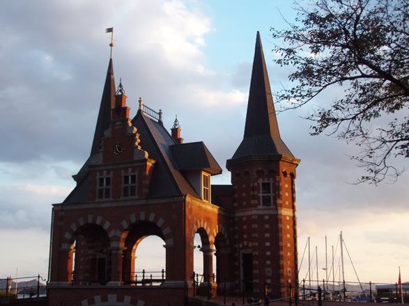
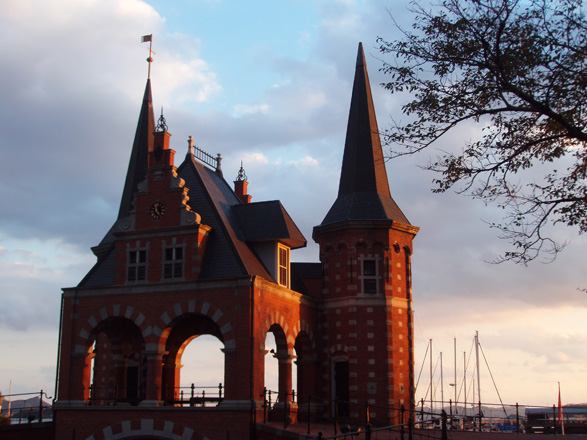
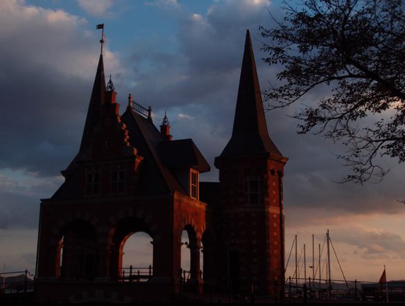
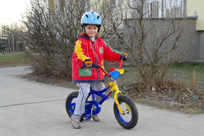
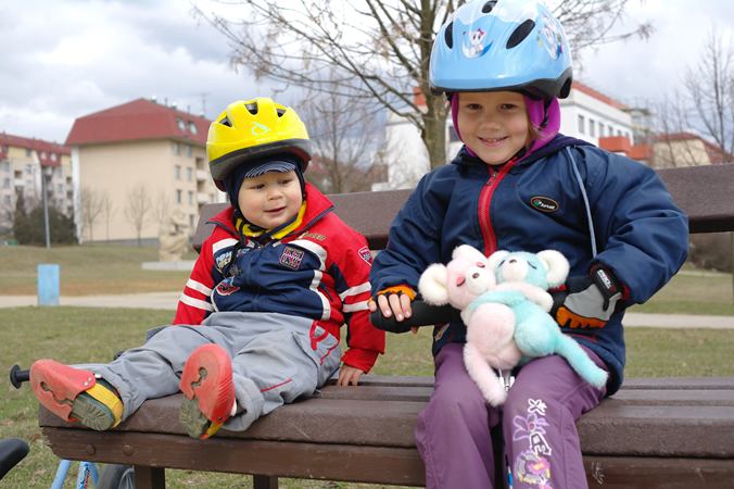
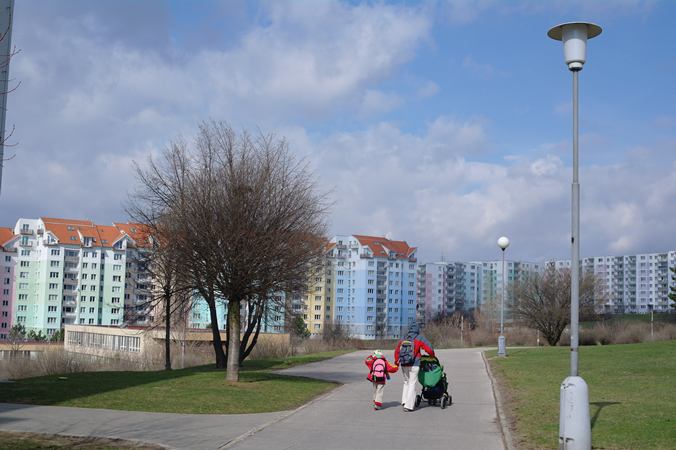
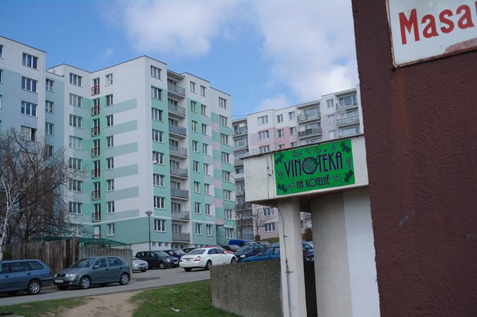
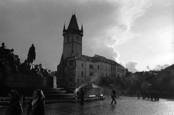
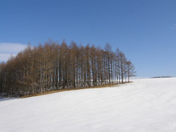
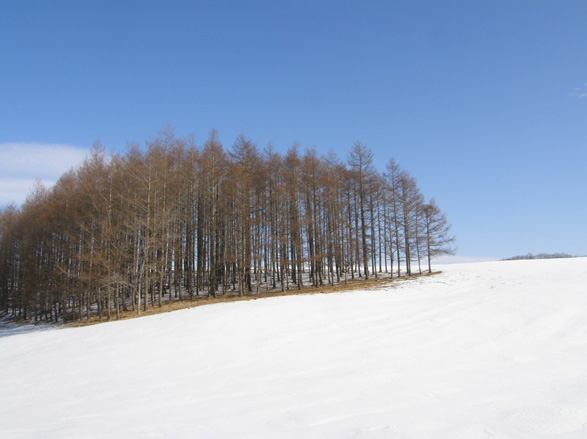
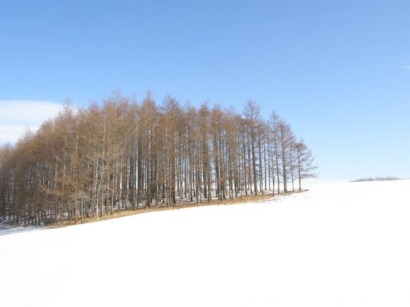
Weeks of kevin v. ton

Hledání světla ve tmě s kevinem v. tonem

kevin v. ton, Grafik, Česká republika

Rubrika Mistři Week of Life je snad nejostřeji sledovaná sekce na našem portálu – co do obsahu sdělení fotografií, tak i do celkového umu zvládnout celé zadání našeho projektu. Proto není pravidelná a musíme vždy čekat, až se vynoří někdo nový. Někdo, kdo svými fotografiemi, ale i svou osobností, kterou do svých fotografií vtiskne, přinese materiál, který stojí za pozastavení, za prozkoumání, za vyzpovídání! Takovou osobnost jsme spatřili v osobě grafika s trochu tajemným jménem, nebo spíš uměleckým pseudonymem, kevina v. tona. Dlouho jsme se rozhodovali, pak rozhodli a po přečtení jeho odpovědí si potvrdili, že nejen rozhodnutí na základě jeho fotografií bylo tou správnou volbou.

Jak jste se dozvěděl o projektu Week of Life a co Vás přimělo se do něho zapojit?

O projektu Week of Life jsem se více dozvěděl někdy v půlce října loňského roku od mého dávného kamaráda z jihu Čech. Sice jsem už před tím něco málo zaslechl, ale nic bližšího, nic konkrétního, co by přitáhlo moji pozornost. Právě na návštěvě u něj, když mi na monitoru ukazoval svůj připravovaný týden, když jsme si prohlédli na stránkách WoL vystavené týdny dalších fotografů a když jsem zjistil, že jde o projekt pana Ziky, jsem se rozhodl též se pokusit zapojit. A během čtrnácti dnů jsem opravdu začal. O tom, že na projektu pracuji, nikdo nevěděl, a i v rodině se to dozvěděli až po několika měsících, kdy už byly všechny snímky naskenovány a celý týden připraven k publikování. Nápad sloučit výsledky týdenního výtvarného dokumentárního vidění fotografů roztroušených po celém světě “pod jednu střechu” mi přijde nejen unikátní, ale i velice potřebný. To, že je možné sledovat jednotlivé všední žití v průběhu dne a týdne ze všech koutů naší planety, umožňuje zároveň lépe si uvědomit skutečnost, že tam všude žijí lidé. Lidé se svými všedními radostmi i starostmi bez ohledu na barvu pleti, režim, do kterého se narodili, či ekonomickou situaci země, ze které pochází.

Pracujete jako grafik. Můžete upřesnit o jaký obor grafiky se jedná?

I když sám sebe považuji především za fotografa, živím se hlavně jako výtvarník, kreslíř, typograf, počítačový grafik. Každá zakázka obsahující v zadání tvůrčí svobodu je pro mě výzvou, ať se jedná o obal CD začínající nezávislé kapely nebo o corporate identity prosperující společnosti.

Svůj první černobílý týden jste jako jeden z mála nafotil na film. Co Vás k tomu vedlo, mělo Vaše rozhodnutí nějaký hlubší význam?

S negativním černobílým filmovým materiálem pracuju skoro čtvrt století a stále velice rád. Za tu dlouhou řádku let jsem se naučil tahat s sebou jednu či dvě obstarožní F3 od Nikonu a k tomu jednu emkovou Leicu. Na každém těle jiné sklo a v každém jiný film. Nejčastěji používám ilfordí Delty – čtyřstovku a třitisíce dvoustovku a pak Neopan šestnáctistovku. Pořád mám pocit, že jejich jedinečné charakterové vlastnosti včetně výsledného vizuálního vzhledu těžko kdy vůbec digitální záznam nahradí. Dokumentární fotografie a filmový záznam jsou jako nevěsta se ženichem – dohromady mohou tvořit dokonalý pár, rodinu, která je schopná přivádět na svět nádherné potomstvo v podobě úžasných fotografií. Přesto však digitální fotoaparát používám a poctivě si pro sebe hledám jeho kouzlo, které v sobě bezpochyby také musí mít. A třeba díky práci na mém filmovém týdnu v rámci projektu WoL už jsem i jedno našel. Tím je pro mě rychlost zpracování zaznamenaných dat.

Je velice příjemné číst, že někdo v dnešní době ještě takto věří negativu a klasické fotografii. Povězte mi více o Vašem názoru na to, jak se situace bude vyvíjet do budoucna, zda přijde jednou konec analogu nebo budou s digitálem spolu navěky?

Trochu zapeklitá otázka, krapet spíše o předpovídání budoucnosti. Osobně jsem ovšem přesvědčen, že ještě dlouho půjdou světem společně ruku v ruce analogový a digitální záznam. A pevně v to doufám. Jde o podobnou situaci, jakou s nástupem cédéček a digitalizace v hudbě počátkem osmdesátých let zažilo staré dobré elpíčko. Přes ohromný ústup z trhu se dodnes, i po třiceti letech, gramofony vyrábí a desky lisují a oboje se prodává. Pořád je naštěstí na světě dostatek lidí, kteří mají rádi zvuk desky i s jejími “nešvary” jako je škroupání, skřípání, vrzání a třeba i potřeba manuálního otáčení k poslechu druhé strany. Cédéčko tyhle mouchy nemá, ale zas mu chybí cosi, co člověk často i bytostně potřebuje. Prvek náhodnosti, narušení stereotypu. Podobné je to s i kinofilmem, či s filmovým materiálem jako takovým. Co se mu někdy vyčítá jako nedokonalost, vnímám jako klad. Omezení na šestatřicet snímků člověka naučí vnímat situaci koncentrovaně, všemi póry, soustředit se na podstatu, výsledný snímek vidět v hlavě ještě před jeho exponováním. Třeba i proto, že vyměnit film přece jen chvilku trvá. Pro jeho vlastnosti vybírám si ten film, který dané scéně nejlépe vyhovuje. A škrábance jsou prostě třešinkou na dortu. A vždycky se dají vyretušovat. Digitál, na rozdíl od analogu, umožňuje enormní nárůst kvantity, ovšem nikoliv se zárukou vyšší kvality. Ve skutečnosti je v podstatě celkem jedno, jaký se používá nástroj, zda analogový nebo digitální. Důležitý je obsah. Sdělení. Moment, který mluví. Divák primárně nepotřebuje vědět z pozadí vzniku snímku vůbec nic, je to jen technická záležitost. Divák obraz buďto přijme, a nebo ne.

Na vašich fotografiích je vidět, že se nebojíte práce s tmavými situacemi, s atmosférou v noci. Máte nějaký větší vztah k černé nebo k sytým tmavým barvám?

Nemyslím, že bych měl nějaký stálý, výraznější vztah k jakékoliv z barev, potažmo pak k barvě černé, třeba oproti bílé, když už jsme u mých, povětšinou černobílých fotografií. Tyto dvě barvy jsou protipóly, jeden bez druhého nemůže být. Jing a jang. Ovšem hledání člověka ve stínech noci, hledání pravdy nasvícené pouličními lampami, výlohami opuštěných obchodů, pomrkávajícími neóny či světly projíždějícíh aut, hledání člověka v temných zakouřených hospůdkách, v zákoutích ztichlých měst, tak tohle hledání světla ve tmě, to mám rád. Syrovost prostředí. Autenticitu. Momenty, kdy nekašírované lidské touhy a potřeby vystupují ze šera noci.

Vaše „babička opírající se o zeď“ byla zařazena jako titulní fotka Výběru redakce. Nelze si také nepovšimnout bezdomovce v dece pod lampou a další fotografie na toto téma. Máte sociální cítění, fotíte rád „v podpalubí“?

Zajímá mě především člověk. Člověk a jeho úděl, jeho místo na slunci, naplnění jeho snů i dopad jeho proher. Hledám podstatu. Podstatu lidství. Hledám člověka, ať je kdokoliv, ať je kdekoliv, ať je čímkoliv. Hledám člověka v člověku.

Vaše fotografie jsou emotivní a vyvolávají v člověku reakce, což je jistě hlavním účelem dokumentu. Myslíte, že Week of Life má možnost a nebo alespoň šanci vyvolat v budoucnu v lidech emoce, pocity, zamyšlení a udělat svět třeba o kousek lepší?

Week of Life je velice zajímavý projekt a má v sobě po dokumentární stránce ohromný potenciál. Jak už to u dokumentu často bývá, jde o běh na dlouhou trať. A u Week of Life jde vlastně o trať nekonečnou, obíhající nespočetněkrát celou zeměkouli. Možnost prohlédnout si svět očima jiného kolegy fotografa, žijícího třeba přesně na opačné straně naší Země, je úžasná. Podaří-li se dlouhodobě udržet nastavenou fotografickou laťku vysoko, případně ji ještě zvedat, a nesklouzne-li časem projekt k výměně víceméně rodinných snímků, doplněných vysvětlujícím vyprávěním pro snažší pochopení, tak jako u jiných sociálních sítí, stane se velkolepým fotografickým archívem, dokumentem, který nemá svým rozsahem obdoby. Emoce, pocity a zamyšlení vyvolává WoL již dnes a pevně věřím, že možnost poznávat se navzájem i touto fotografickou cestou může napomáhat k odbourávání různých předsudků či zaběhlých názorových stereotypů a tím přispět k posunu v myšlení celého lidstva a opravdu svět udělat, byť třeba jen o kousek, lepší.

Týdny kevina v. tona

Joao Carlos

Když posledního ledna 2010 odborná porota v čele s Antonem Corbijnem a Stevem McCurrym oznámila deset jmen Hasselblad Masters 2009, byl Joao Carlos mezi nimi…

Nelenil jsem

autpr:Juao Carlos

Jakmile společnost Hasselblad už podeváté za sebou oznámila vítěze své prestižní soutěže Masters Award, uvědomil jsem si, že vás o tuto exkluzivní fotografickou událost nesmím připravit. A protože přední světoví profesionálové zaslali své snímky do deseti kategorií, měl jsem logicky výběr z deseti velmi kvalitních vítězů oněch kategorií. Má volba padla na Joao Carlose a myslím, že to nebyla volba špatná. To posuďte sami.

Ale ke kategoriím…

Loňský ročník Hasselblad Masters se vyznačoval nejen nezvykle vysokou kvalitou a vyrovnaností soutěžících, ale i excelentní porotou, která měla spoustu práce s výběrem těch nejlepších z finální stovky profesionálů (počet přihlášek prý přesáhl tři tisícovky, tedy dvojnásobek oproti ročníku 2008). Rozhodovala kreativita, kompozice, síla koncepce a technické provedení. Nebudu vás ale napínat. Vítězové jednotlivých kategorií jsou:

Architecture – Stephan Zirwes, Stuttgart, Německo
Editorial – Nina Bergman, New York, USA
Fashion/beauty – Dirk Rees, Londýn, Velká Británie
Fine art – Quentin Shih, Peking, Čína
General photography – Mark Zibert, Toronto, Kanada
Nature/landscape – Bang Peng, Hongkong
Portrait – Claudio Napolitano, Miami, USA
Wedding/social – Joao Carlos, New York, USA
Product – Mark Holthusen, San Francisko, USA
Up-and-coming – Lyle Owerko, New York, USA

S většinou těchto vítězů a s krásnou výstavou jejich prací bychom se měli setkat (ještě to není potvrzeno) na Photokině v Kolíně nad Rýnem…

A kdo je Joao Carlos?

autor: Juao Carlos

Na titulní straně svého webu píše, že by chtěl vyprávět příběhy prostřednictvím svých fotografií…Opravdu není průměrným a běžným fotografem. To mohu potvrdit. Je vizionářem v pravém slova smyslu, tak trochu fotografujícím rockerem a hlavně je velkým, kreativním živlem. Narodil se v New Yorku portugalským rodičům, pracuje zde, ale do Evropy a do Portugalska se rád a často vrací pro témata a inspiraci. Jeho inspirací je malba a malířství (často až 18. století), používá převážně přírodní světlo a snaží se o stále nové a nové, vizionářské fotografické příběhy. Výčet jeho prací je téměř nekonečný, a tak jsem vám vybral pár snímků z vítězné kolekce Hasselblad Masters a pár dalších…

Přeji vám krásnou podívanou,

Rudolf Stáhlich, šéfredaktor časopisu FotoVideo
Mediální partner:
FotoVideo

Autor: Juao Carlos Autor: Juao Carlos
Autor: Juao Carlos Autor: Juao Carlos Autor: Juao Carlos

Fotografování krajiny – Sníh 2

Použití korekce expozice

Čistě bílé zasněžené scenérie bývají překrásné. Není tak těžké je vyfotografovat, ale může být obtížné zachytit onu bělostnou čistotu. Následující technika vám umožní docílit sněhobílého vzhledu snímku.

Použití korekce expozice k posílení dojmu ze sněhobílých plání

Většina fotoaparátů je vybavena funkcí Korekce expozice. Bělost zvýšíte jednoduše nastavením směrem k [+]. Buďte ale opatrní, protože by výsledkem mohl být snímek, jehož vzhled by neodpovídal realitě. Pokud bílou barvu posílíte příliš výrazně, může se ztratit veškerá kvalita sněhu, takže při nastavování kontrolujte výsledný efekt na displeji.
Funkce Korekce expozice mění jas obrazu. S její pomocí můžete změnit náladu snímku nebo vzhled objektu. Zasněžené scenérie jsou jedním z příkladů, pro které je obtížné nastavit korekci expozice. Nastavením směrem k [+] můžete docílit bělejšího, jasnějšího snímku, ale přílišné posunutí expozice může vést k přeexponování. Pro jistotu můžete pořídit několik snímků s různým nastavením.

Změna vzhledu zasněžené scény pomocí Korekce expozice

Co je dobré vědět

  • Přílišná korekce směrem k [+] může zapříčinit přeexponování. U některých modelů fotoaparátů můžete kontrolovat přeexponování na displeji po pořízení snímku, jiné modely umožňují kontrolu pomocí histogramu při pořizování snímku.
  • Velmi užitečnou funkcí je „auto bracketing“, která umožňuje pořídit v řadě za sebou několik snímků s různými nastaveními. Funkce pořídí několik snímků za sebou a vždy automaticky změní hodnoty nastavení. To oceníte zejména v případech, kdy je obtížné nalézt optimální nastavení fotoaparátu. Otevřete „Užitečné tipy: Používání funkce auto bracketing“.

Taking Pictures of Landscapes – Snowscenes 2

Snow scenes in pure white can be very beautiful. It’s also not that hard to take pictures of them, but it may be difficult to capture that pure-white look.    

Sníh 1

Taking Pictures of Landscapes – Snowscenes 2

 
Using Exposure Compensation
Snow scenes in pure white can be very beautiful. It’s also not that hard to take pictures of them, but it may be difficult to capture that pure-white look. Try this technique to get the snow-white look in the picture.

Using Exposure Compensation to Bring Out the Look of Snowfields
Most cameras include the Exposure Compensation function. You enhance the whiteness simply by adjusting towards the [+]. But be careful as this may result in a picture with a look different than in reality. If you emphasize the white color too much, the whole quality of the snow may be lost so check the effect on the monitor while making the adjustment.
The Exposure Compensation function changes the brightness of the picture. Using it you can alter the impression of the picture or the condition or look of the subject. Snow scenes are one example of the subjects for which it is hard to adjust the exposure compensation. By adjusting towards [+] you can get a whiter, brighter picture but doing it too much can result in overexposure. To be on the safe side you can take several pictures with different adjustment values.

Changing the look of a snow scene using Exposure Compensation


Useful things to remember

  • Adjusting too much towards [+] can result in overexposure. On some models you can check for overexposure on the playback display after taking a picture, and other models allow you to check the white balance using a histogram while taking pictures.
  • Auto bracketing is very convenient to take several pictures at different adjustment values. The auto bracketing function takes a number of pictures changing the adjustment value automatically. This can be handy especially when it is difficult to find the best adjustment value. Open "Useful Tips: Using the auto bracketing".